All projects
Product designB2B SaaSMobile-first2026

Catalog builder: a mobile-first B2B SaaS redesign

Rebuilding a cluttered, desktop-only inventory tool into kata.io, a dark-theme catalog manager merchants can run entirely from their pocket.

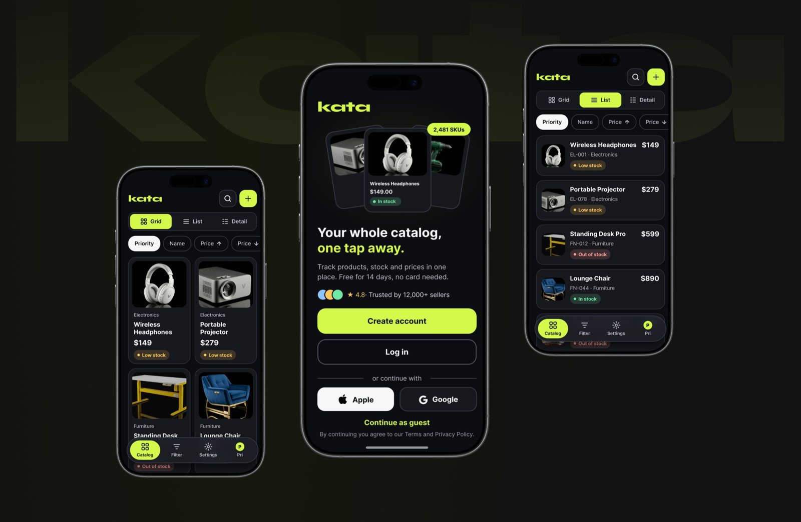
Three Kata app screens: catalog grid, sign-up and catalog list
Problem

E-commerce merchants struggle to manage complex product catalogs, track inventory and update SKUs on the go, because their software is cluttered and built for desktop.

Solution

A mobile-first, dark-theme B2B catalog manager that lets users switch between high-level data and granular detail, automate inventory alerts and add products without breaking flow.

Impact

A scalable platform that lets users build, analyze and share interactive catalogs seamlessly across devices.

Tools

Figma for interface design, Claude for systems thinking and content.

Key strategic UI decisions

01 · Navigation

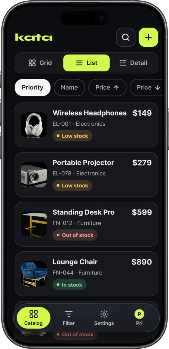
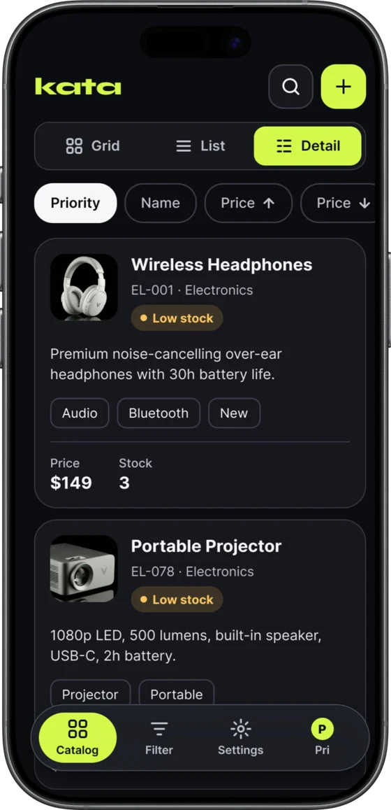
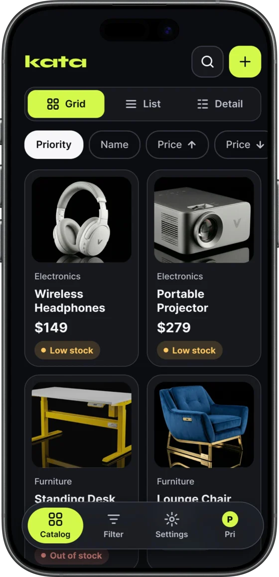
Contextual view modularity: Grid, List, Detail

UI choice
A persistent toggle in the top navigation lets users switch instantly between Grid (visual-heavy), List (scanning-heavy) and Detail (data-heavy) views of the same catalog.
Business value
Different merchants carry different mental models. Visual brands lean on Grid to check aesthetic consistency, while wholesale distributors rely on List to scan SKUs and prices fast. One architecture serves several personas.
Kata catalog in Grid view Kata catalog in List view Kata catalog in Detail view
02 · Personalization

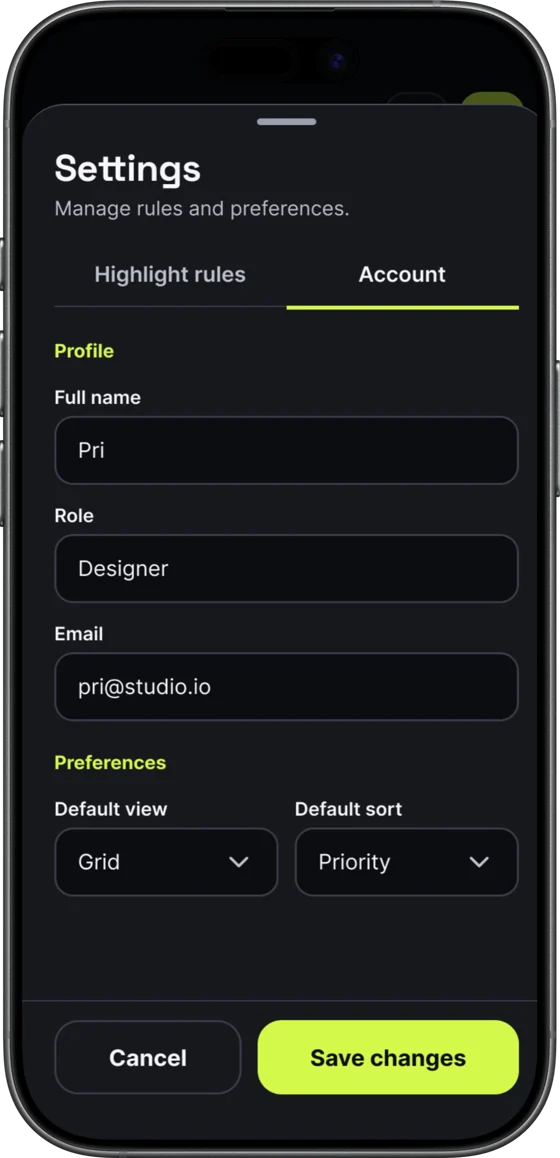
Tailoring the experience: profile and workspace preferences

UI choice
An Account settings panel organizes identity details (name, role and email) and workspace defaults into clean inputs and simple dropdowns.
Business value
Letting users set their default view and sorting removes repetitive setup every time they open the app. It streamlines daily work and adapts the interface to each team member's role.
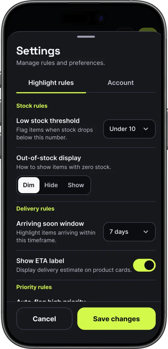
Kata settings: highlight rules for stock and delivery Kata settings: account profile and preferences
03 · Data entry

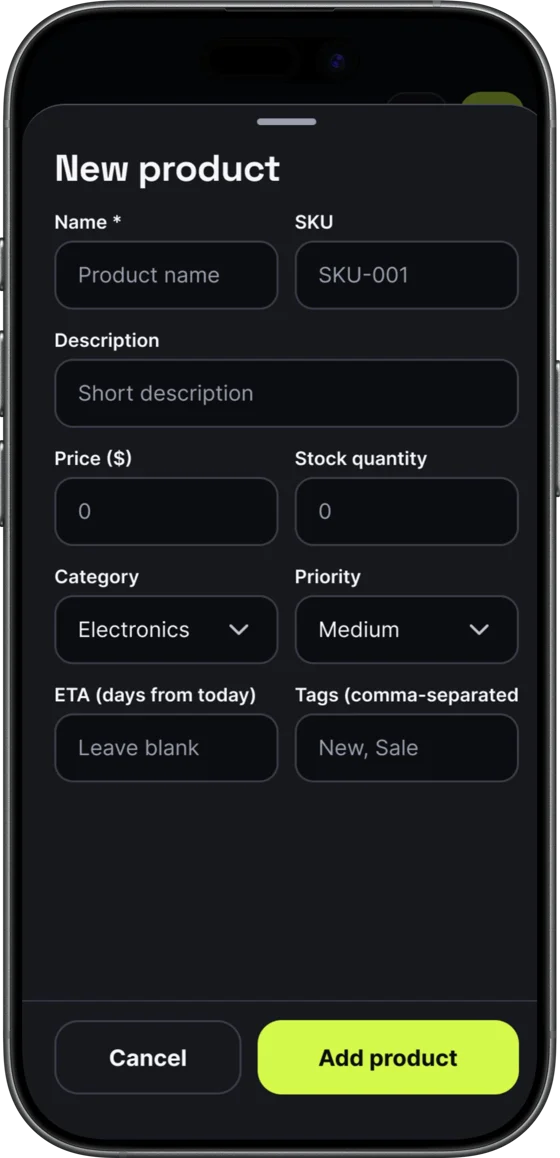
Frictionless data entry: the New Product bottom sheet

UI choice
The New Product flow lives in a bottom sheet instead of a full page. Fields are grouped logically into core info, pricing and inventory, and categorization, with clear, accessible inputs.
Business value
The bottom sheet keeps the catalog visible in the background, so users keep their context. They carry less cognitive load and can add several SKUs quickly without getting lost in deep navigation.
Kata New Product bottom sheet

Key learnings

Density requires discipline

Designing a data-heavy application for mobile demands a strict typographic hierarchy. Monospace-style figures for prices, SKUs and stock quantities kept numbers legible and scannable, even in dense list views.

Contrast is functional

The high-contrast neon accent guided the eye to primary actions, like the floating action button and the "Save changes" button, without overwhelming the otherwise muted, data-focused interface.

Next steps

Have a product that needs this kind of clarity?